Heber Adventures Club
An Adventure Club Brand That Gets People Out the Door.
Adventure club · Brand identity, Logo system, Website
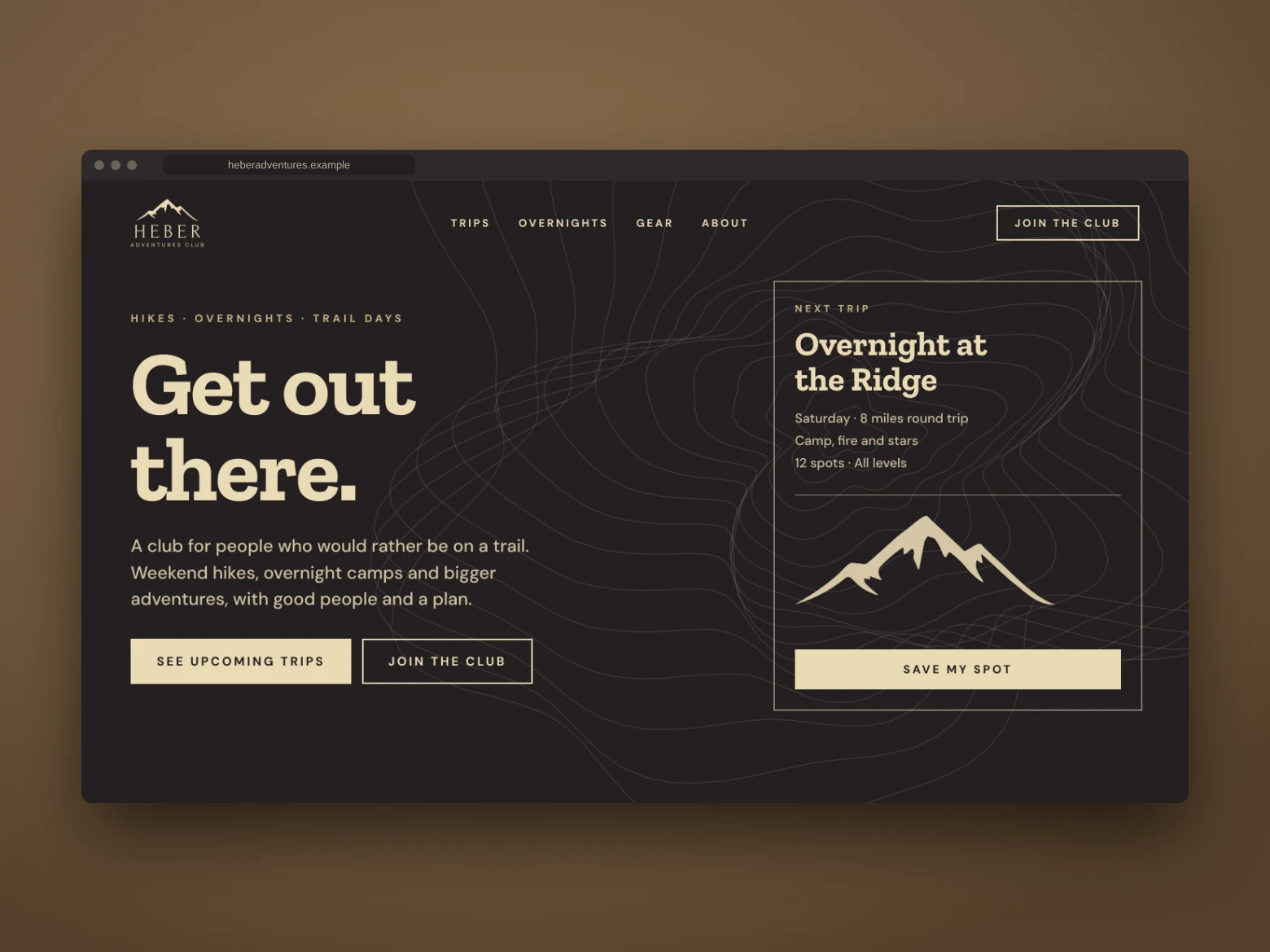
Heber Adventures Club is a concept for a group that heads out on trails, day hikes, overnights and bigger adventures. The brand needed to feel rugged but welcoming: a hand-drawn ridgeline, a calm cream-on-black palette, and a website that fills the next trip.
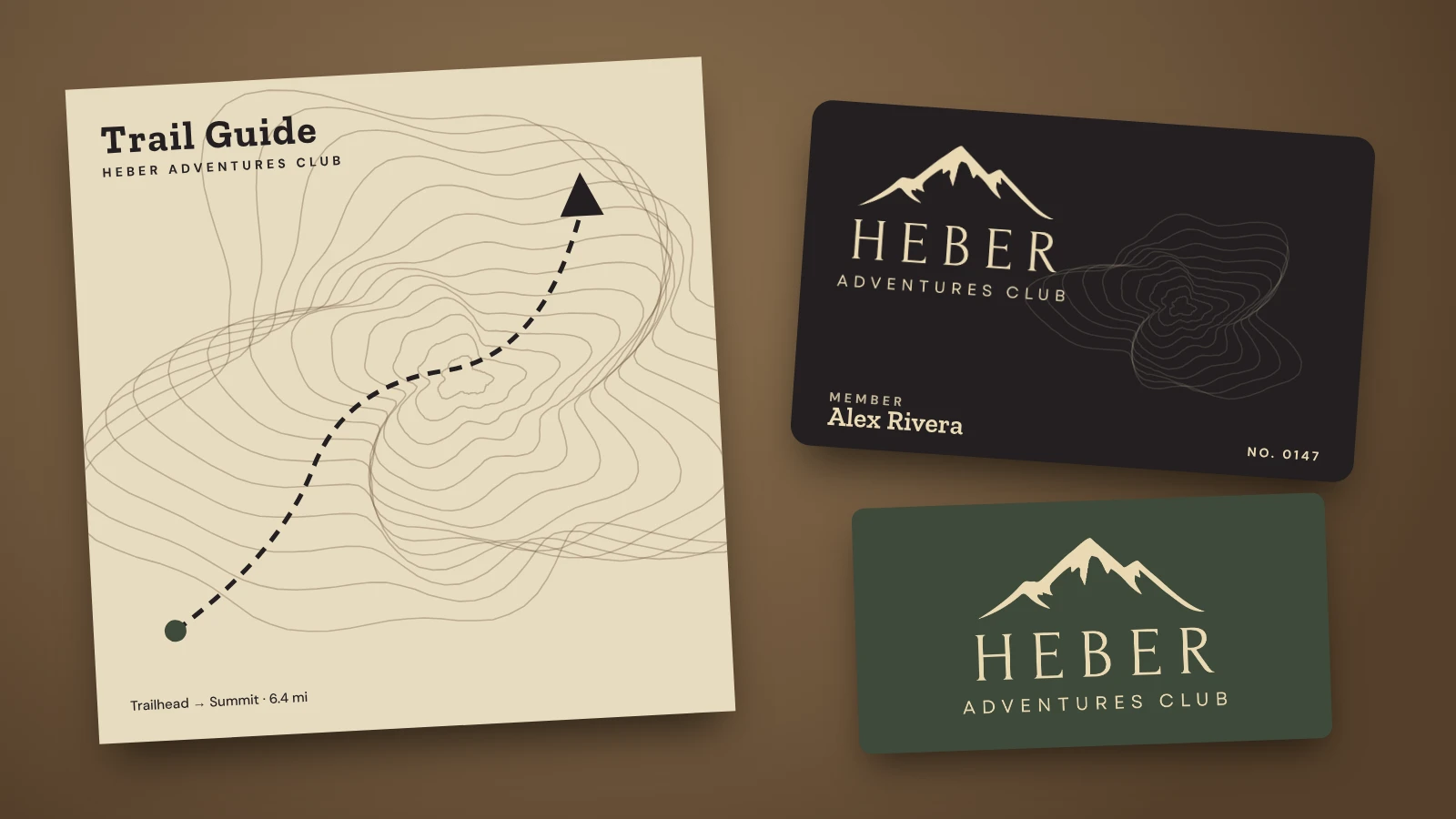
Heber Adventures Club starts with a ridgeline and a promise: go outside, bring good people, and come back with a story. The mountain mark is drawn loose and natural, like a line you would trace on a trail map, and the spaced capital letters give the name the calm of a summit view.
Brand identity
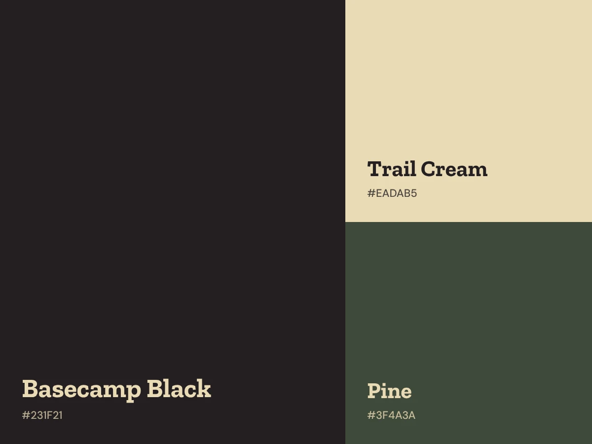
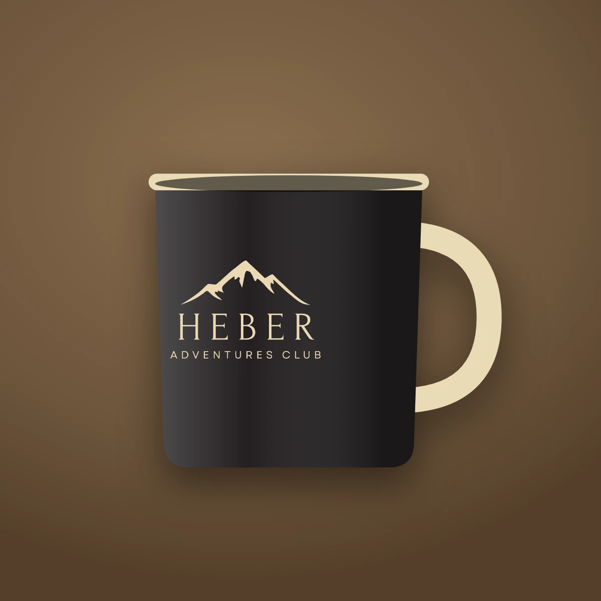
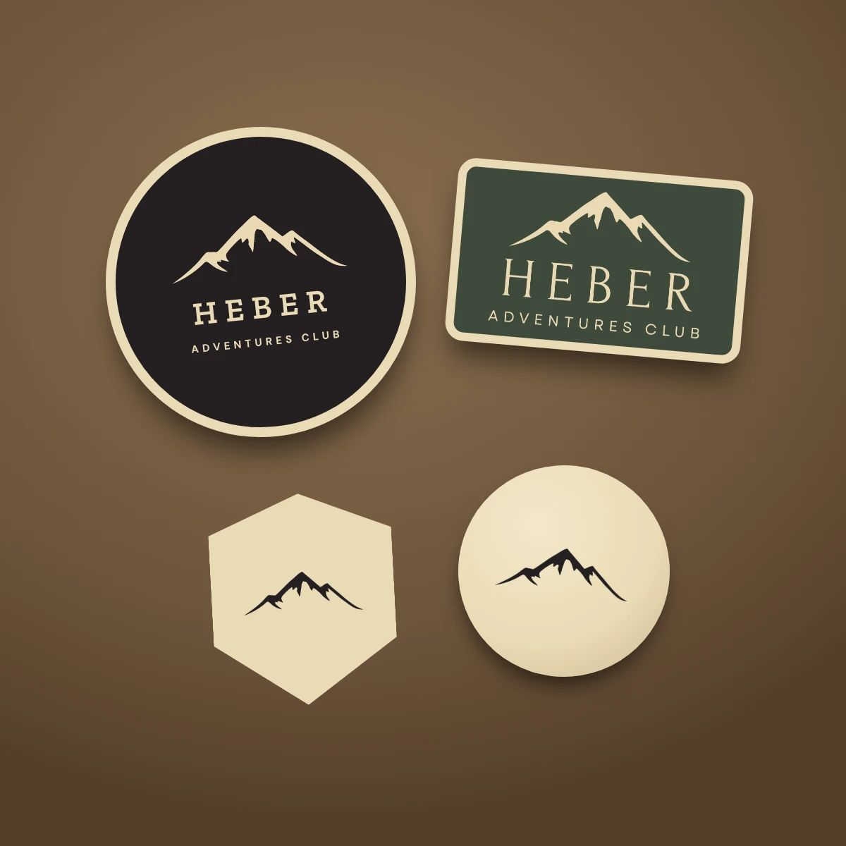
Two colors do the heavy lifting: Basecamp Black and Trail Cream, with a deep pine green held in reserve for patches and gear. The serif name feels established, the small spaced line beneath feels like a trail marker, and topographic lines add texture on maps, cards and the website. The mountain works alone on a patch, a pin or a mug, and with the name for the full logo.
The website
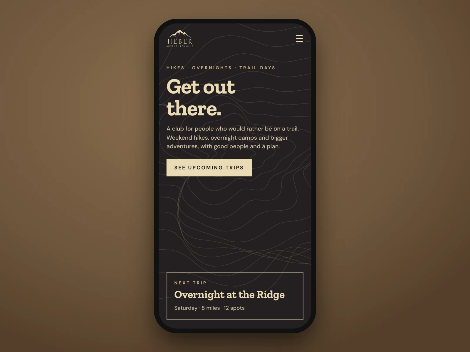
The website is built to fill trips. The opening screen says plainly what the club is, shows the next trip with the date, distance and open spots, and gives one clear button to save a place. It reads clean on a phone, which is where most members will be checking the trail plan.