Astro Esports
An Esports Brand Built to Play Like It’s in Orbit.
Esports organization · Brand identity, Logo system, Website
Astro Esports is a concept for a competitive gaming organization that wanted an identity as bold on a stream as it is on a jersey: an armed astronaut mascot, a blocky glowing wordmark, and a dark palette with a hit of visor orange.
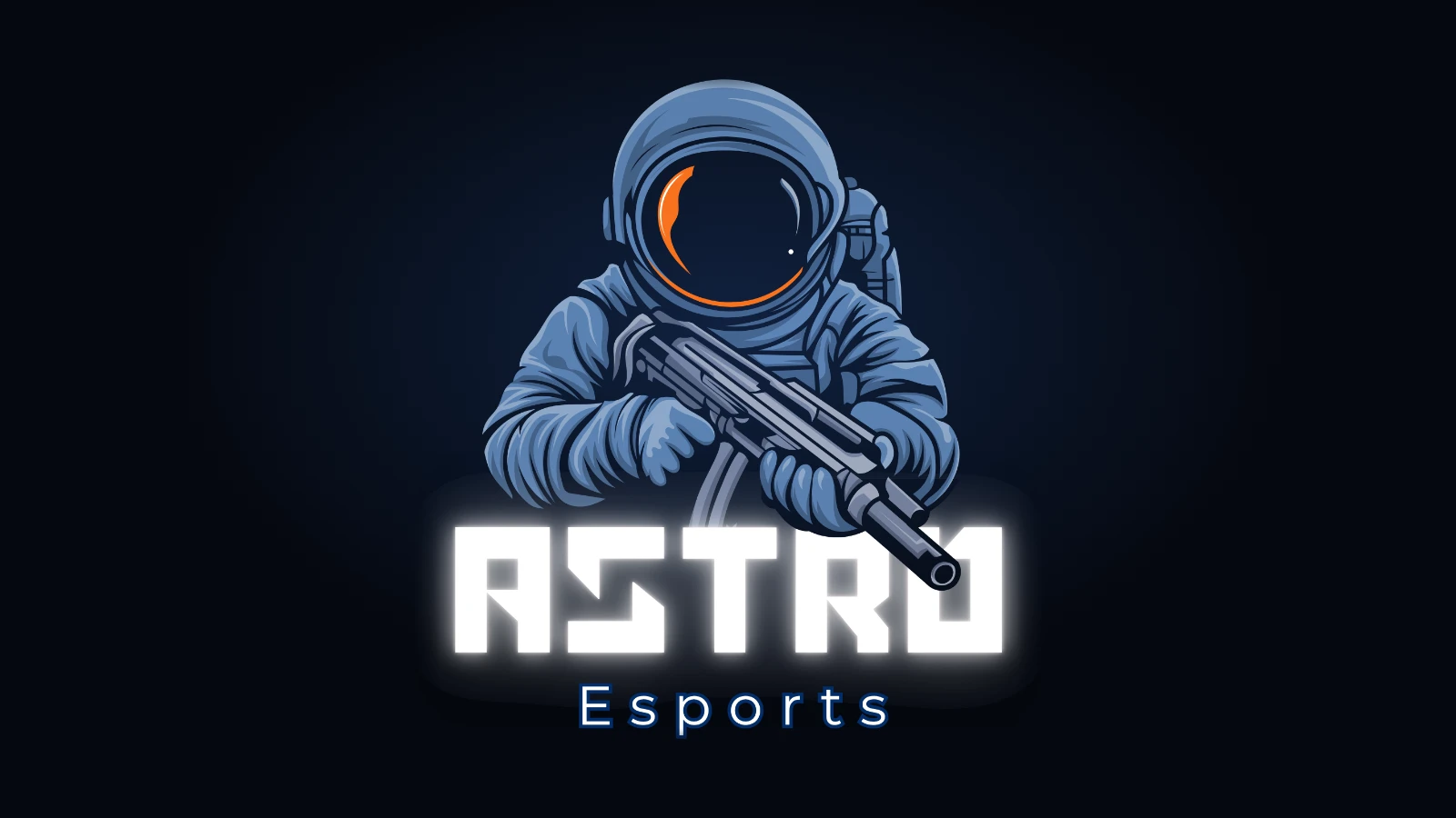
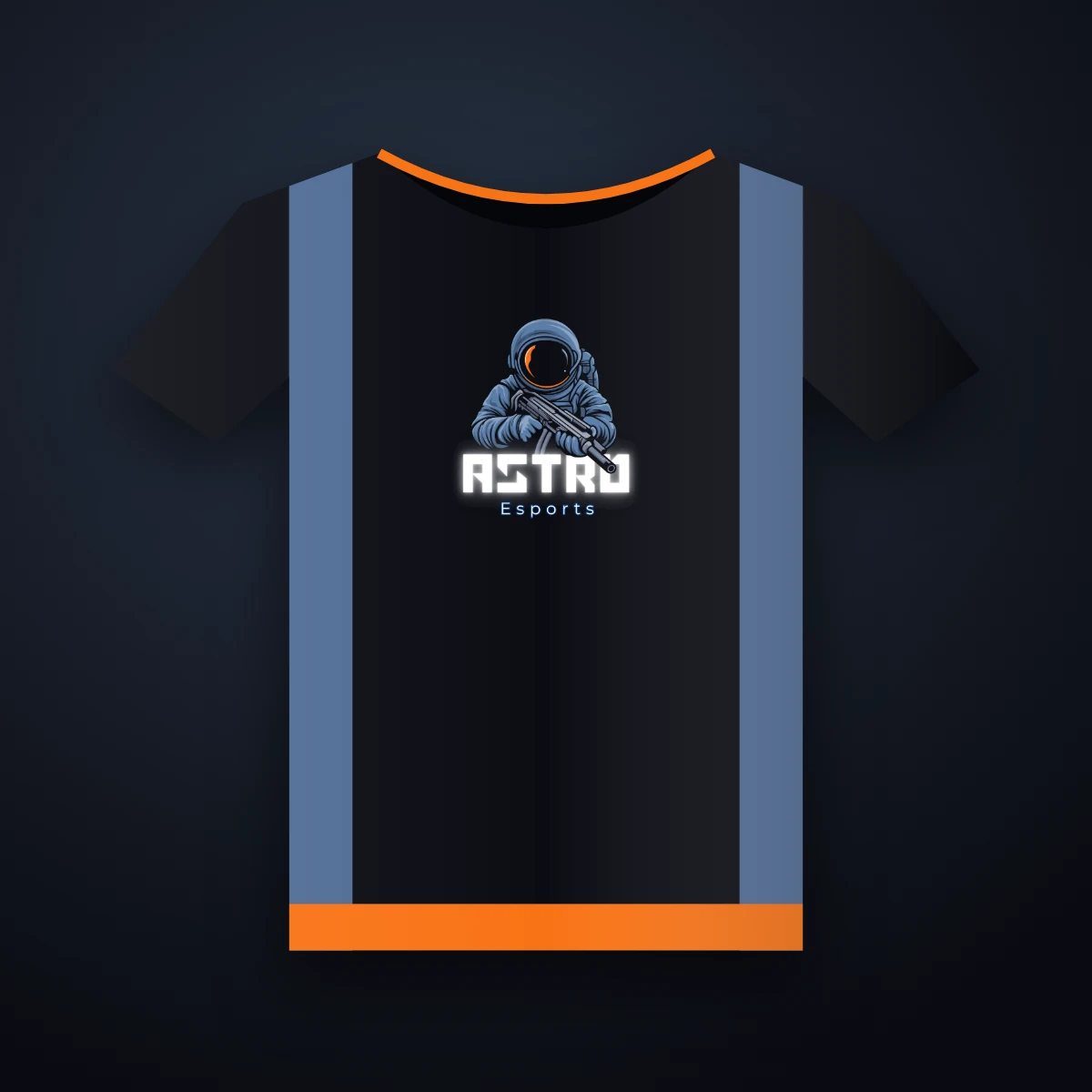
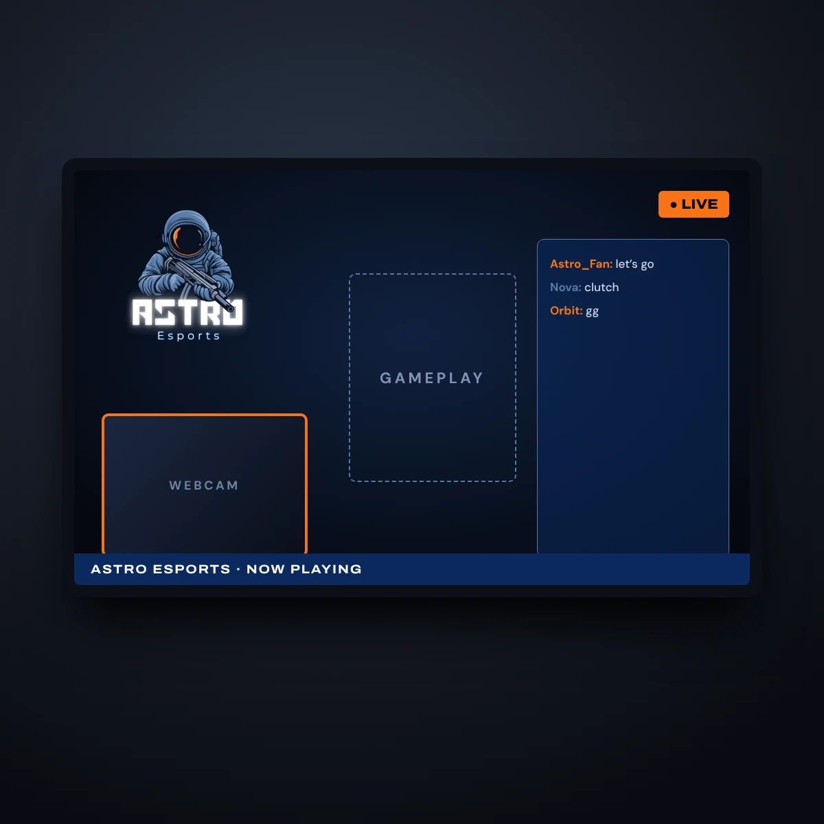
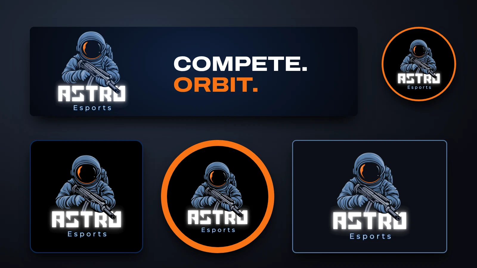
Astro Esports is built around one image: an astronaut who looks ready to compete. The visor reflects a bright orange flash, the wordmark glows like a scoreboard, and the whole mark sits on a deep black that feels like space. It gives a gaming squad a face players and fans can rally around.
Brand identity
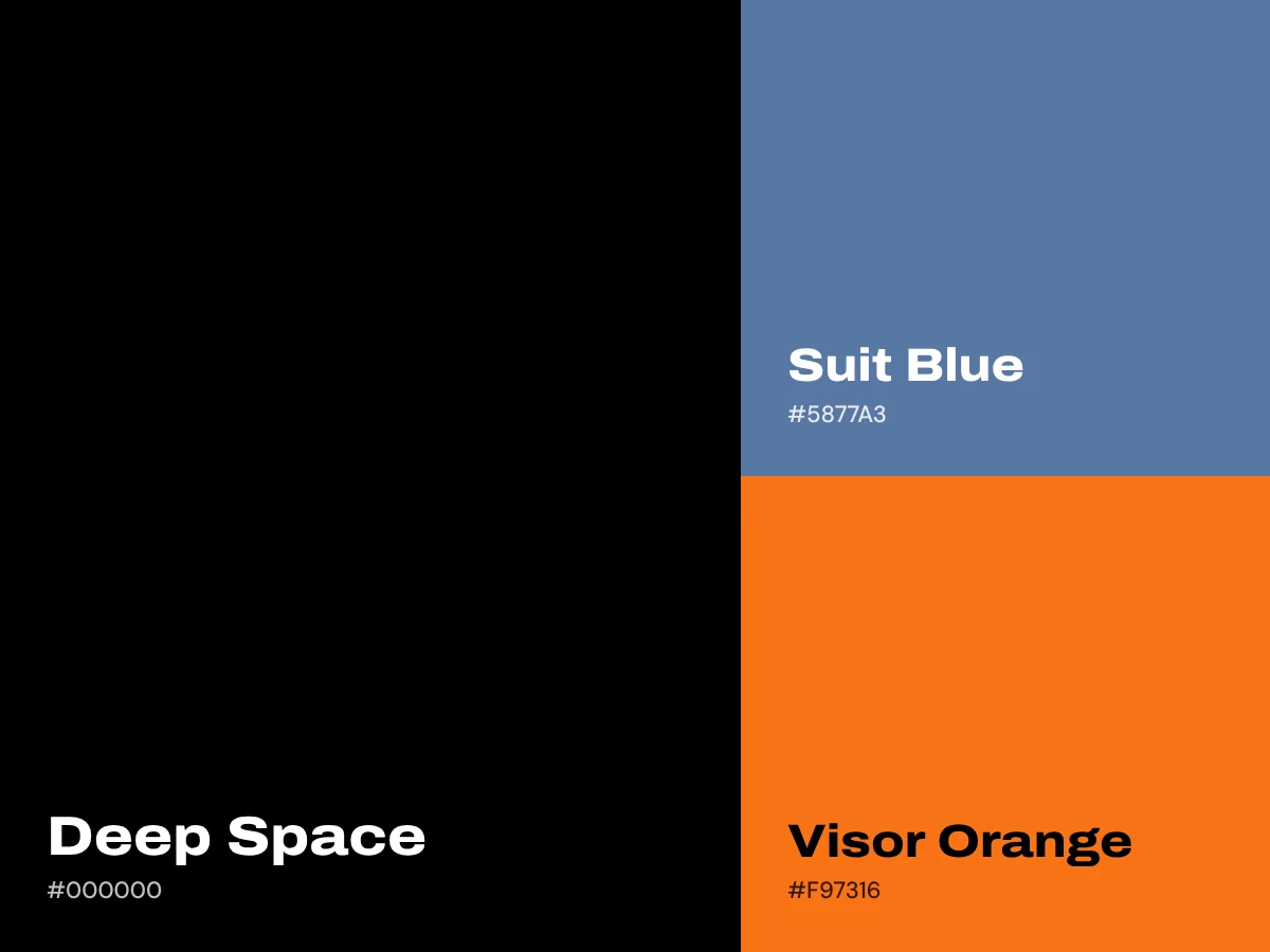
The palette is deep space black, suit blue and visor orange, so the mascot pops on streams, jerseys and social avatars. The blocky lettering is easy to read at thumbnail size, and the smaller “Esports” line sits underneath like a team tag. The mascot works alone as an avatar and stacked with the name as the full logo.
The website
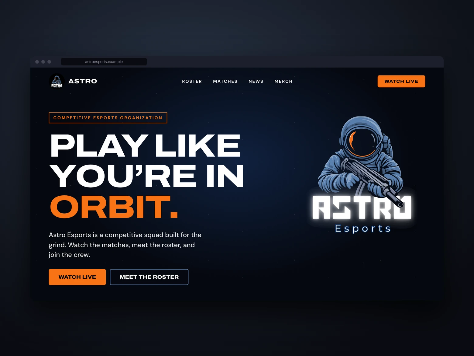
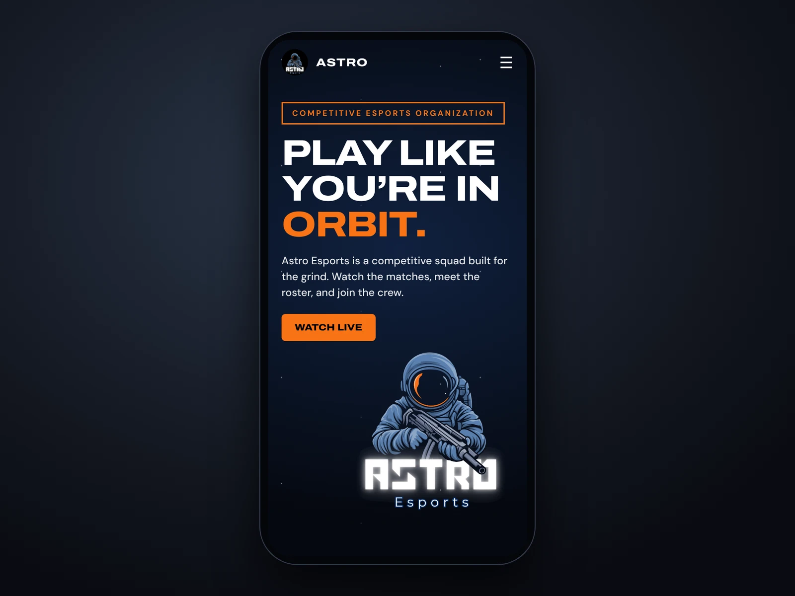
The website speaks to fans first. The opening screen has a big headline, a clear Watch Live button and the mascot front and center, with the roster and matches one tap away. On a phone it stacks into a single column, which is how most fans will watch.